For week three of Art and Animation, we were asked to create UI for our Cookie Clicker so I decided create some buttons, one for the player to click and two for the upgrades.
Ideas
As my Cookie Clicker is themed around the original game, I decided I wanted to create a pixel art version of a monitor displaying this. I also didn’t want to have all my buttons in the game to be overly complex and too much to look at, so I decided to stay with the pixel art theme and design two simple button variants.
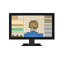
The Main Button
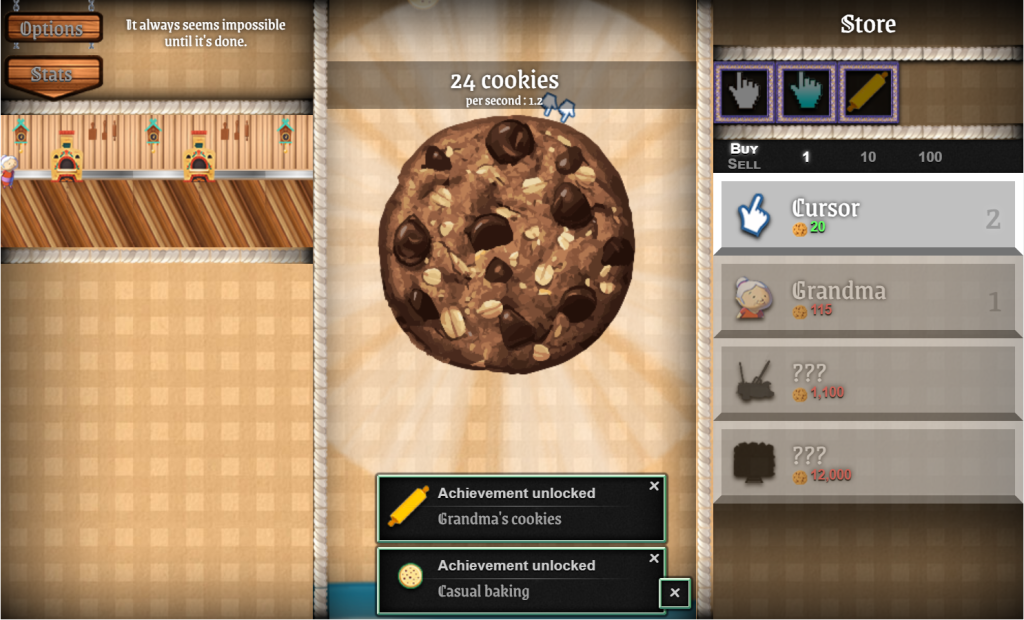
For the main button, I wanted to recreate the image above, but in pixel art. After I had drawn out the shape of the monitor, I attempted to recreate the rough outlines of the layout of the original game using the pencil tool in Photoshop and selecting similar colours to use. I believe that this was successful as you can clearly see the similarities between my design and the original UI. This would function as the main button in my Cookie Clicker game.
Upgrade Buttons
I wanted these buttons to be quite simple but still work with the other button I created, so I made some very basic pixel art buttons so when it came to making the game itself I would have options.


I left these buttons blank so that when I eventually implemented them into Unity, I could add the relevant text without having to make several of the same buttons with different text.
Overall, I think these buttons turned out as intended and are a good fit for the style of game I was creating. Despite being relatively simple to create, I think that the main button is clearly recognisable as Cookie Clicker and isn’t confusing. As well as this I think the upgrade buttons are clear and effective for what I intend to use them for, which is simply for text.
References:
Thiennot, J. (2013) Cookie Clicker [Video game]. DashNet, Playsaurus. Available online: https://cookie-clicker2.com/